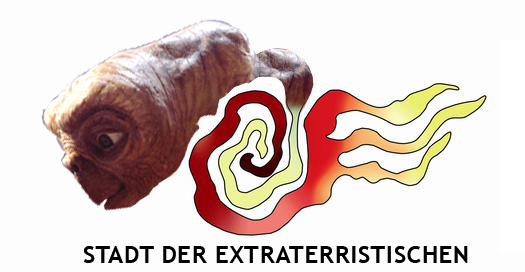
Last year the German city of Cottbus initiated a nationwide design contest for their new logo and a reward of € 8000 for the winning entry. A couple of days ago a local newspaper revealed the winner and it’s horrible. The selected logo is so bad, people have created viable alternatives and also sarcastic copies of it.


More alternatives at Fontblog

OMG that’s horrible – now i’m blind.
Not as bad as the London 2012 Logo…
@rdj: in my opinion the London 2012 logo is also bad but at least there aren’t as many colors and it looks as “clean” as it can be. the cottbus logo not only has an ugly yellow, it has tons of ugly colors.
I’ve been to Cottbus, this is a perfect logo for that sad city.
@StBernard 🙂
Reminds me of:
“How to squeeze the most awful colours into the most hideous shape”
I mean there have GOT to be better ideas out there then this “thing”
Did the people holding the contest select the logo by random drawing? I honestly cannot conceive how this logo was chosen. I feel better about the horrible logo my city has now. So I guess something good came of this monstrosity.
It looks like vomit!!!! What is that??? What does it mean?? I really don´t know who is more crazy the person who did it or the person who chose it…