Skip to content
Nader

Nader

  • Blog
  • Photo

Best Buy’s New Logo

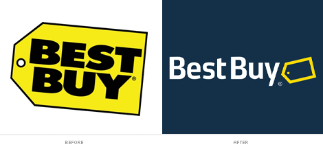
Founded in 1966 as Sound of Music and renamed to Best Buy in 1983, the consumer electronics giant is one of the largest retailers of its kind with its low prices. After years of using the old logo that looked like a $1 bin, Best Buy now has a very modern and clean new logo. With over 1,000 stores worldwide Best Buy will have to spend a great deal of money to rebrand their locations.

I like the new logo. What do you think?
[via Brand New, Ad Goodness]
  • Share
  • Facebook
  • Twitter
  • LinkedIn
  • Reddit
  • Pocket
  • Email
Published October 17, 2008By Nader
Categorized as Branding, General Tagged logo, rebranding

Post navigation

Previous post

WordPress Plugin “Most Comments” + Widget

Next post

Keep Holland Clean

Nader
Proudly powered by WordPress.
loading Cancel
Post was not sent - check your email addresses!
Email check failed, please try again
Sorry, your blog cannot share posts by email.