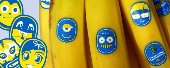
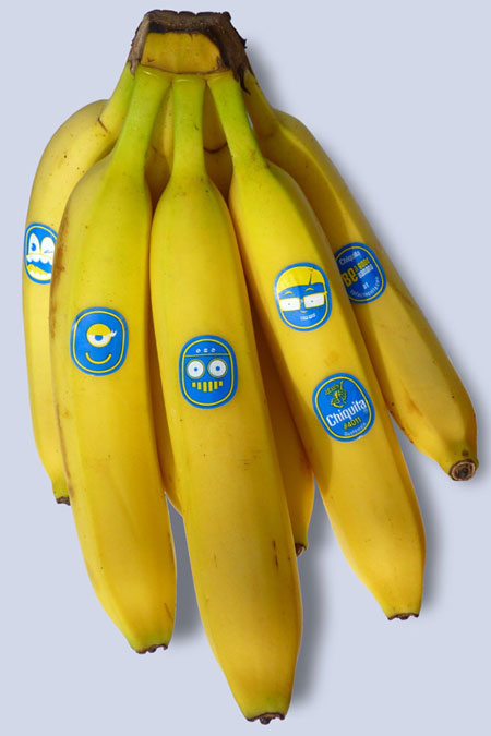
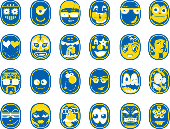
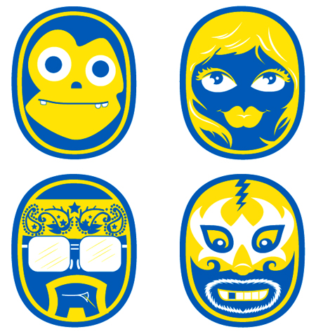
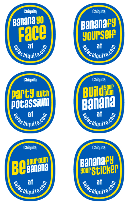
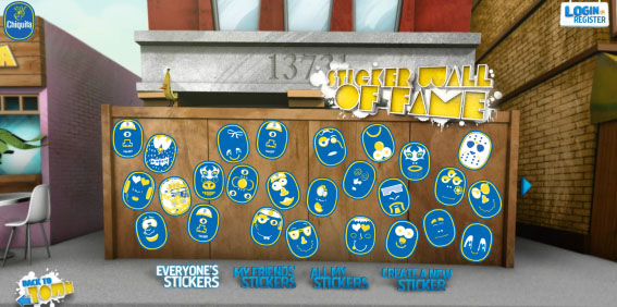
Chiquita Banana recently got a rebranding and introduced their sticker characters. Staying true to themselves with that familiar blue and yellow color scheme, it was imperative that they build upon their brand equity rather than start from scratch.
The client’s goals were kind of like that dream brief you get handed that simply says: “Make bananas cool.”. As a branding and design junkie myself I think this is one of the most awesome rebrands lately.
The cornerstone of the campaign relied on the little blue stickers, the biggest icon for the brand, and the biggest way to get the word out…
Designrelated got a chance to interview the art director DJ Neff about the process of making bananas even cooler.
Click here for the campaign site.
Not enough? Here is a huge collection of Chiquita Stickers from all over the world and something funny for halloween: a Chiquita Banana Costume

I wonder if we will see those bananas in Europe soon!?
Those bananatastic stickers are probably the smallest branded bits of coolness in the entire grocery store. Plus, they unseated Miss Chiquita as Chiquita’s brand icon, no small feat. http://is.gd/aHlYD
Leveraging stickers to boost your brand = complete awesomeness. At Lightning Labels (a custom label and sticker printer), I continually preach this message myself. This is one of the best examples of it I have seen so far. Thanks for sharing this with us. Great post!
This is a great idea for Chiquita, what a simple, inexpensive way to differentiate their brand. I also have seen Chiquita bananas with Donky Kong Wii stickers, another creative way to cross promote.