The only thing missing is the logo moving to the right and eating the wordmark 🙂
Tag: logo
Make My Logo Bigger Cream & The Whitespace Eliminator [Fun]
httpv://www.youtube.com/watch?v=qgcX0y1Nzhs Designers, don’t be annoyed by clients anymore who want changes to your carefully crafted design: use the “Make my logo bigger”-Cream! Not enough? Use the “Whitespace Eliminator”. Funny Friday.
Logo Remix: Subzero, Moogle, Shell…Ring A Bell?
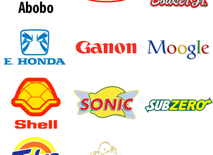
Most of these logos, created by gamer Steve Napierski, are remixed in a way that you would immediately recognize the real brand behind it, others might take a second look. I didn’t get Belmont = Dupont and Tonberry = Burberry at first, but might vary according to your exposure to those brands each and every… Continue reading Logo Remix: Subzero, Moogle, Shell…Ring A Bell?
Unilever Logo: The Icons Explained
Unilever, the gigantic corporation behind a lot of popular consumer brands, has an interesting tidbit about their logo: all those little icons (25 in total), woven together to form a U, actually mean something. In 2005, Unilever changed the logo to represent their new theme of vitality, replacing the old logo that had been used… Continue reading Unilever Logo: The Icons Explained
NASA Corporate Brand Guidelines
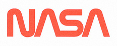
Look at a piece of history: the NASA Corporate Guidelines from 1976, designed by Danne and Blackburn. Here is a great flickr set and if you want to read more, a post about it. An additional image after the click. a very generous tutor from my old college found the time to scan me some… Continue reading NASA Corporate Brand Guidelines
Famous Logos In Pure CSS
Amazing that those logos are purely done with CSS, no images for JavaScript! Here are more CSS logos.
Chiquita Banana Gets Rebranding: Make Bananas Cool!
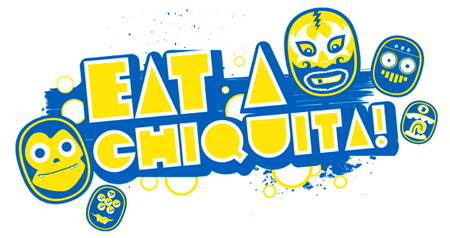
Chiquita Banana recently got a rebranding and introduced their sticker characters. Staying true to themselves with that familiar blue and yellow color scheme, it was imperative that they build upon their brand equity rather than start from scratch. The client’s goals were kind of like that dream brief you get handed that simply says: “Make… Continue reading Chiquita Banana Gets Rebranding: Make Bananas Cool!
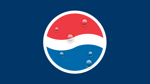
Evolution Or Revolution: What Branding Strategy Pays Off? The Cola Wars Of Pepsi Vs Coke
Coca Cola and Pepsi Cola have been archenemies for over a hundred years. But although their main product is very similar in both taste and color, their branding strategies couldn’t be any further apart. While Coca Cola has only been modifying their initial logo in a very subtle, almost ninja-like way (there’s been very little,… Continue reading Evolution Or Revolution: What Branding Strategy Pays Off? The Cola Wars Of Pepsi Vs Coke
Probably The Worst City Logo Ever Designed
Last year the German city of Cottbus initiated a nationwide design contest for their new logo and a reward of € 8000 for the winning entry. A couple of days ago a local newspaper revealed the winner and it’s horrible. The selected logo is so bad, people have created viable alternatives and also sarcastic copies… Continue reading Probably The Worst City Logo Ever Designed
Pepsi Redesign Gets Official
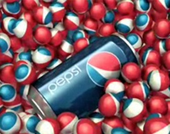
Pepsi reached out to 25 “digital and social media influencers” with three separately-shipped packages. The first contained five cans representing logo design from 1898 to 1950. The second contained five cans from 1962 to 1998. The third contained the newly launched can design – six of them full of actual Pepsi. Also included was a… Continue reading Pepsi Redesign Gets Official