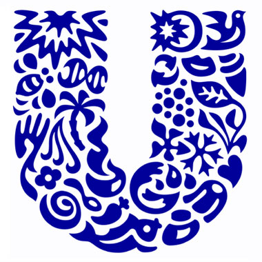
Unilever, the gigantic corporation behind a lot of popular consumer brands, has an interesting tidbit about their logo: all those little icons (25 in total), woven together to form a U, actually mean something. In 2005, Unilever changed the logo to represent their new theme of vitality, replacing the old logo that had been used… Continue reading Unilever Logo: The Icons Explained

