Seen in NYC
Category: Branding
Cold front in Europe “Cooper” Sponsored by Mini
In a clever move by advertising agency Sassenbach for its client Mini, a recent weather low was named after the car “Mini Cooper.” Mini Cooper is one of the latest car models manufactured by Mini Deutschland that coincidentally shares the same name with “Cooper” as a freezing weather condition of Europe.
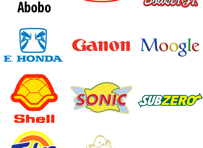
Logo Remix: Subzero, Moogle, Shell…Ring A Bell?
Most of these logos, created by gamer Steve Napierski, are remixed in a way that you would immediately recognize the real brand behind it, others might take a second look. I didn’t get Belmont = Dupont and Tonberry = Burberry at first, but might vary according to your exposure to those brands each and every… Continue reading Logo Remix: Subzero, Moogle, Shell…Ring A Bell?
When Branding Advice Goes Bad
httpv://www.youtube.com/watch?v=PNtdAE2yM60 In this clip we get a new client and Andrew Robinson doles out some fabulously poor branding advice, which the client would do well to ignore.
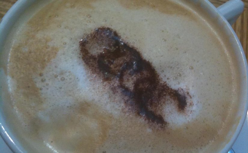
Coffee Branding. Literally. One Audi Capuccino Please.
I spotted this on a facebook profile so I don’t know whether it’s taken at Audi’s headquarters or another place. What is sure though is this brew of capuccino has a tiny but cool detail for spreading the brand and making it stand out. (It has a little blemish but anyway…) This would also work… Continue reading Coffee Branding. Literally. One Audi Capuccino Please.
Unilever Logo: The Icons Explained
Unilever, the gigantic corporation behind a lot of popular consumer brands, has an interesting tidbit about their logo: all those little icons (25 in total), woven together to form a U, actually mean something. In 2005, Unilever changed the logo to represent their new theme of vitality, replacing the old logo that had been used… Continue reading Unilever Logo: The Icons Explained
Famous Logos In Pure CSS
Amazing that those logos are purely done with CSS, no images for JavaScript! Here are more CSS logos.
Chiquita Banana Gets Rebranding: Make Bananas Cool!
Chiquita Banana recently got a rebranding and introduced their sticker characters. Staying true to themselves with that familiar blue and yellow color scheme, it was imperative that they build upon their brand equity rather than start from scratch. The client’s goals were kind of like that dream brief you get handed that simply says: “Make… Continue reading Chiquita Banana Gets Rebranding: Make Bananas Cool!
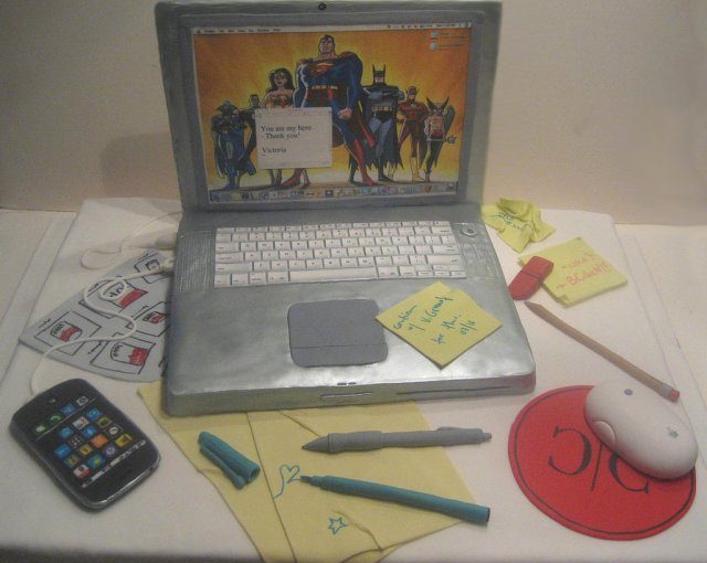
The Branded Macbook Cake – Something For Sweet Fanboys
Can’t wait for the Apple Tablet? Maybe you’re interested in the MacBook cake, a 100% edible rendering created by New York’s BCakeNY The astoundingly detailed cake includes a wireless mouse, sugar Post-It notes and that silvery MacBook Pro sheen.
Evolution Or Revolution: What Branding Strategy Pays Off? The Cola Wars Of Pepsi Vs Coke
Coca Cola and Pepsi Cola have been archenemies for over a hundred years. But although their main product is very similar in both taste and color, their branding strategies couldn’t be any further apart. While Coca Cola has only been modifying their initial logo in a very subtle, almost ninja-like way (there’s been very little,… Continue reading Evolution Or Revolution: What Branding Strategy Pays Off? The Cola Wars Of Pepsi Vs Coke


