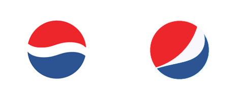
One of the biggest rebrandings in history will take place over the next months and years. Pepsi Co will be revamping the design and identities of their key brands while their sales drop between 2% and 5% in various beverage categories. Only the logo, designed by New York-based Arnell Group has been released so far.

From AdAge:
PepsiCo today said it will pour some $1.2 billion over three years into a push that will include sweeping changes to its brands, including what Chairman-CEO Indra Nooyi characterized as a revamp of “every aspect of the brand proposition for our key [carbonated soft drink] brands. How they look, how they’re packaged, how they will be merchandised on the shelves, and how they connect with consumers.”“Tropicana will also be differentiated, enabling us to re-engage consumers with this iconic brand.”
“We’re initiating similar upgrades for the entire Gatorade line, which will have an entirely new contemporary identity, and there will be exciting innovations for both G2 and Tiger and a renewed Propel platform.”
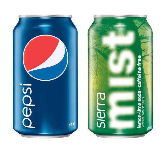
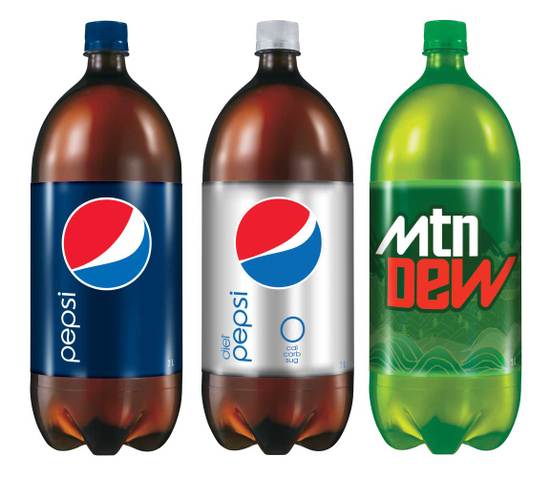
This is how the new cans and bottles will look like. In my opinion the more modern font for the word mark “pepsi” works well but the overall design of cans and bottles is a bit too cheap. Noticed that the logo of Diet Pepsi has a different curve than the rest?
The white band in the middle of the logo will now loosely form a series of smiles. A “smile” will characterize brand Pepsi, while a “grin” is used for Diet Pepsi and a “laugh” is used for Pepsi Max. Also, Mountain Dew will be rebranded as Mtn Dew. The news was first reported in Beverage Digest.


From BevNET:
The brand’s blue and red globe trademark will become a series of “smiles,” with the central white band arcing at different angles depending on the product. Pepsi, Diet Pepsi and Pepsi Max will use all lower-case fonts for name brands. Gatorade will also receive a redesign, focusing the brand on the letter G.Changes will include a graphical redesign of core Pepsi CSDs Pepsi, Mountain Dew and Sierra Mist and a rebranding of some products. Mountain Dew will be renamed as “Mtn Dew” on packages, and Diet Pepsi Max will be known as simply Pepsi Max.

It certainly is graphically clean and very soapy refreshing! I’m seeing a bit of pacman here (yummy yummy!) and a little early 80’s Avante Garde or the new Helvetica movie! I am a retired designer and have over 4000 Pepsi Cans – pretty please XXXX where can I get the new promo packs??? Not sure if design direction will work with today’s generation?
“Today’s target demographic is radically different. The drink is mainly marketed to people in the 12-30 year old demographic group, creating a connection to activities like extreme sports and to the video game culture.” – wikipedia, mtn dew
Why is the pepsi can blue.
because the coca cola can is fire engine red
The new logos are definitely targeting the younger generations.Since the big push on health drinks, soda sales have dropped significantly. This is a shot at reversing the tides so to speak, I myself have offered free soda while out delivering and received the comments “I don’t drink soda”. The Diet Pepsi logo indicates a smirk, Pepsi a smile, Pepsi Max a laugh. Also, the Diet Pepsi Max has had a name change, it is now called Pepsi Max.
…. That’s supposed to be a smile? It kinda looks like it’s supposed to be a ninja wearing an eye patch to me… But a smile… I just can’t see it. Oh well… I don’t like it, regardless of what it looks like or what it’s supposed to be.
I am a new york based graphic designer. Honestly….Almost all graphic designers around me says “This is really ugly Logo”. ( If they do ugly marketing.. this logo could be perfect).
sorry.
im a designer, and in terms of the target audience, hate it
sorry mate, it wouldn’t work
graphic designer from istanbul…this must be a joke or something…
Get back the 1999-2005 mtn dew logo
I liked their 1973 logo. It was true Pepsi. Now these new ones, i don’t know …