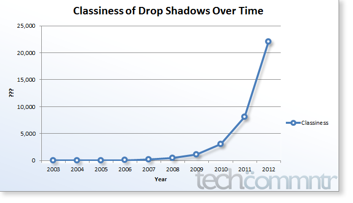
A humorous but true, at least in my perception, representation of one of the current web design trends: drop shadows. Just like 45° lines were all hip in the late 90ies, or, using gradients and massive typography for everything drop shadows are becoming increasingly popular as well. I don’t have anything against drop shadows when… Continue reading Drop Shadows All Over The Place
Category: Design
Apple’s Attention To Detail
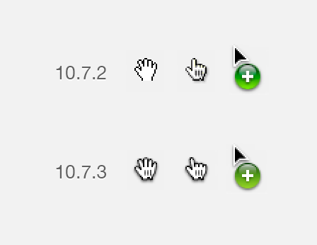
…shows best with this picture: a miniscule but still significant change from OS X 10.7.2 to 10.7.3. I just wonder why they had to bend the pointing hand, it now looks a little bit like Mickey Mouse’s hand to me.
Nando Costa for Design Is Kinky
Abstract Pussy Illustration by Nando Costa for Design is Kinky. Back in the days.
London Tube Map Built With Drinking Straws
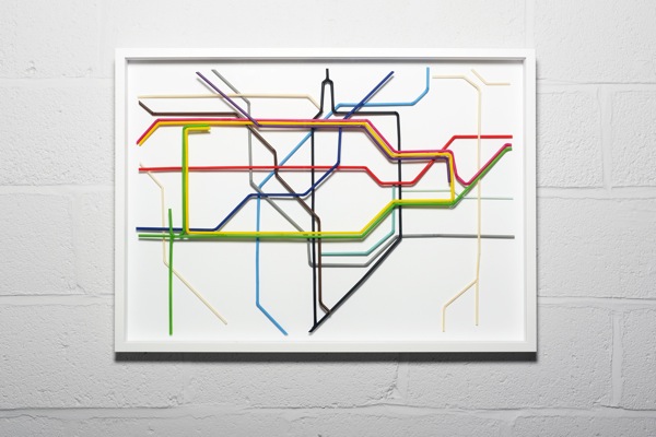
How cool is that!? Brighton-based artist Kyle Bean built the London tube map solely with drinking straws, more specifically Zone One of London’s underground system. Recreating a company’s logo using drinking straws would also be pretty cool. What do you think? More pictures after the click.
Crashed Ferrari Table
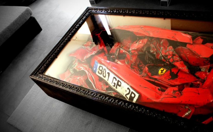
A crashed Ferrari becomes a table. French artist Charly Molinelli obtained a Ferrari 308 from a scrap press, created a wooden frame and put a piece of glas on top: the first “Crashed Ferrari Coffee Table”. Pretty flamboyant. Too bad my apartment is too small and besides, it costs over $15,000. Well, still cheaper than… Continue reading Crashed Ferrari Table
25 Creative, Helpful & Funny 404 Error “Not Found” Examples
After countless hours of development everybody is happy when pushing a website or application live. What people usually forget is to create meaning-, helpful or at least creative “404 Error Not Found” page. This is not something developers often pay attention to but should. Most sites have a banal message like “Not found” and essentially… Continue reading 25 Creative, Helpful & Funny 404 Error “Not Found” Examples
20 Creative 404 Error “Not Found” Page Examples
After countless hours of development everybody is happy when pushing a website or application live. What people usually forget is to a create meaning-, helpful or at least creative “404 Error Not Found” page. This is not something developers often pay attention to but should. Most sites have a banal message like “Not found” and… Continue reading 20 Creative 404 Error “Not Found” Page Examples
The Comic Sans Project Strikes Back
After the great Comic Sans Criminal, a project which tried to drag people finally away from this overused and horrible font, here’s the entertaining opposite: The Comic Sans Project: WE ARE THE COMIC SANS DEFENDERS. WE FEAR NO FONTS AND WE WILL MAKE THE WHOLE WORLD COMIC SANS. BECAUSE HELVETICA IS SOOO 2011 Keep an eye… Continue reading The Comic Sans Project Strikes Back
Twitter’s Redesign Looks Nice
httpv://www.youtube.com/watch?v=0qqDy5BmYKE Twitter on Thursday introduced a new look for Twitter.com and TweetDeck that it hopes will simplify the user experience. One major difference on the homepage is that tweets appear on the right side and take up less real estate than they used to. What you can see from the video the redesign looks really… Continue reading Twitter’s Redesign Looks Nice
Unilever Logo: The Icons Explained
Unilever, the gigantic corporation behind a lot of popular consumer brands, has an interesting tidbit about their logo: all those little icons (25 in total), woven together to form a U, actually mean something. In 2005, Unilever changed the logo to represent their new theme of vitality, replacing the old logo that had been used… Continue reading Unilever Logo: The Icons Explained

