Editions are live
Editions are live: https://nader.io/editions/
I like how nader.io looks right now. The poster grid is the version I want people to see first, and it stays at /.
I also like drawing new ones. That comes from the splash screen era, K10k, Design Is Kinky, Lessrain. I made splash screens back then and swapped mine out constantly. The one part I would not bring back is the “Enter website” click sitting in front of the content.
So the front pages go side by side instead. Every one I draw keeps its own URL. I can make a new one on a Sunday, link it, send it to a friend, show the same work in a completely different design, and nothing moves for anyone who just came to read a post.
They are not screenshots. Each edition reads the same posts, projects and art as the live site, so a front page from months ago still shows what I published this morning, in its own layout and its own type. Search only sees the current one.
Four so far.
Poster
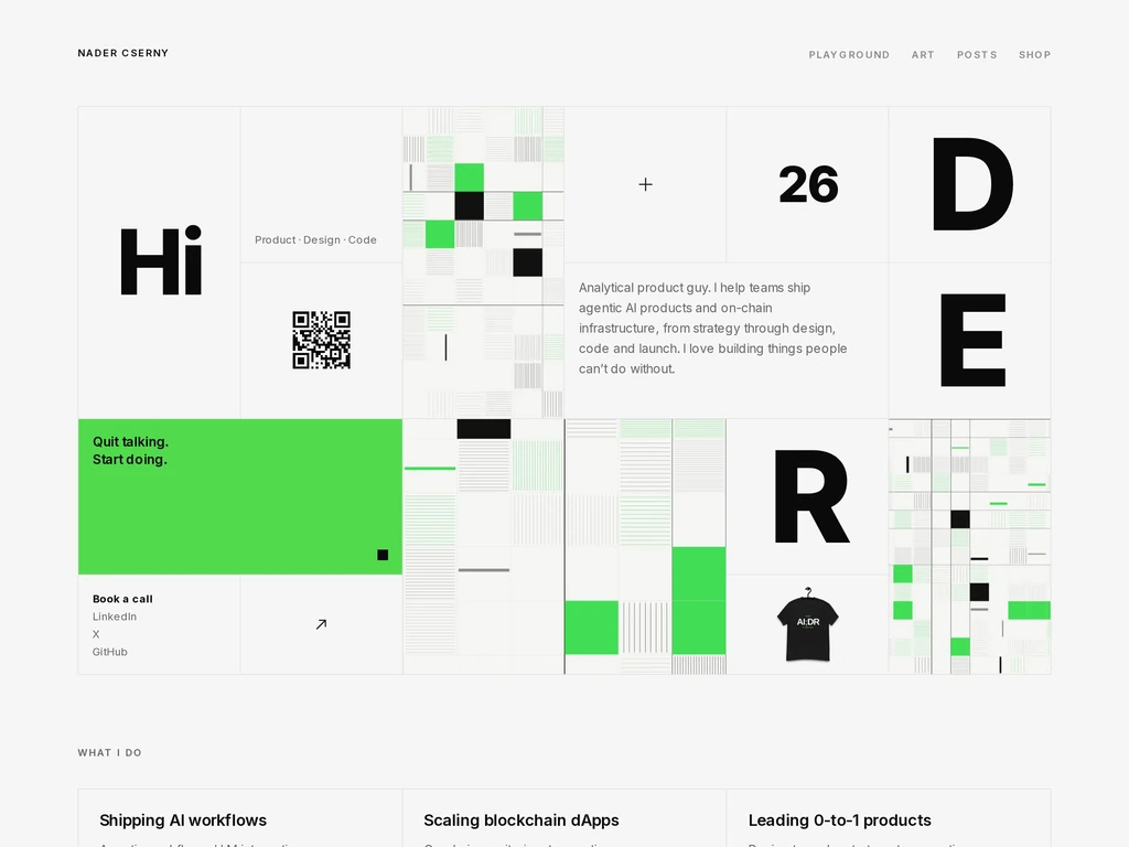
The grid running today. Ruled cells, one loud green, the name broken across the right margin.
Orbit
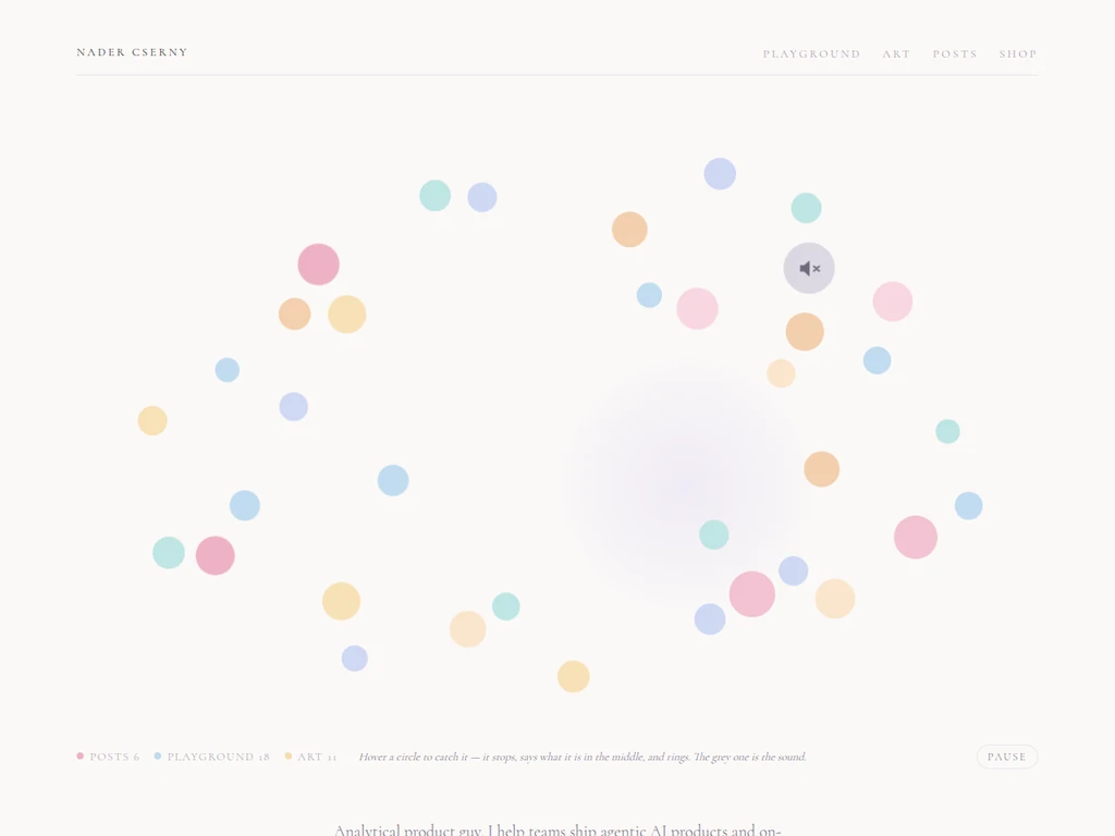
Every post, project and piece of art is a circle in orbit, and none of them holds its course. They wander, they get gusted, and drifting distractions pull them off the ring. Catch one and it stops, says what it is, and rings.
Monochrome
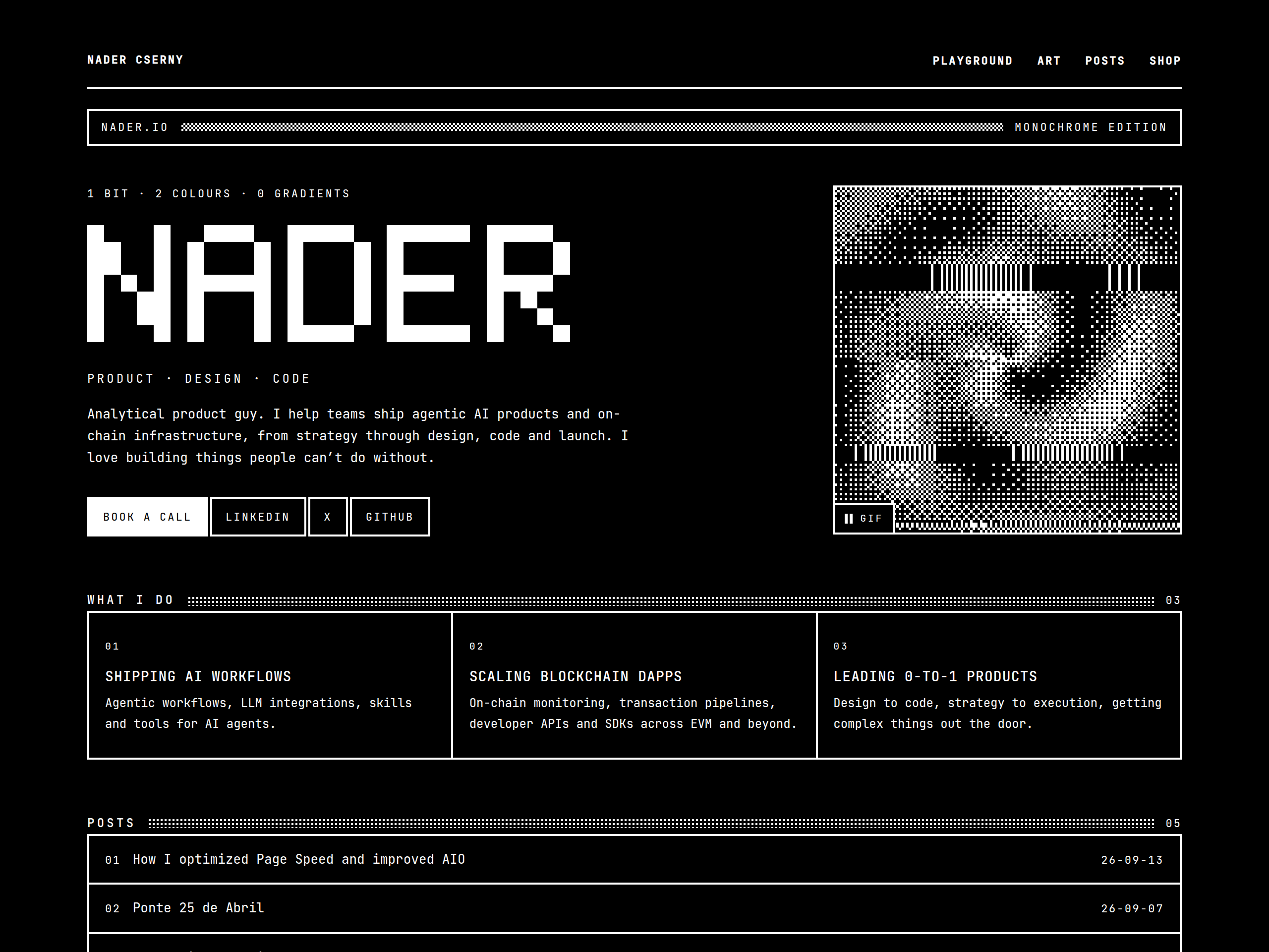
One bit per pixel, no grey anywhere. Every middle tone is black and white pixels arranged so the eye mixes them, and the name is drawn from a 5x7 bitmap rather than set.
Spring
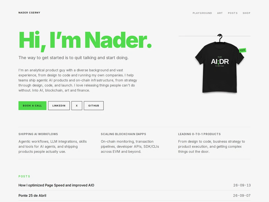
The editorial page the grid replaced. A green display line, the shirt hanging beside it, everything below set as plain ruled lists.
Next one whenever I feel like it.