The only thing missing is the logo moving to the right and eating the wordmark 🙂
Category: General
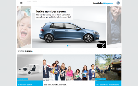
VW’s Hyper-Responsive “Das Auto. Magazine” Launches
Volkswagen just launched its hyper-responsive magazine “Das Auto. Magazine“, a state-of-the-art webmag conveying the emotions of VW’s brand experience. The magazine is multi-language and consists of several articles enriched with interactive HTML5 infographics and big imagery. The assets scale and rearrange from desktops all the way down to mobile devices.
Untitled
I live in Excel Google Docs.
Happy Halloween By Samsung
This post is not sponsored by Samsung although their pumpkin looks pretty cool 🙂
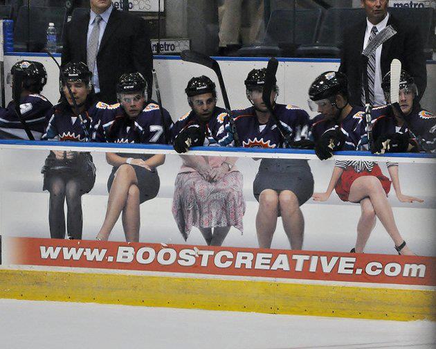
Chitchat: Successful Icehockey Ambient Ad by Boostcreative
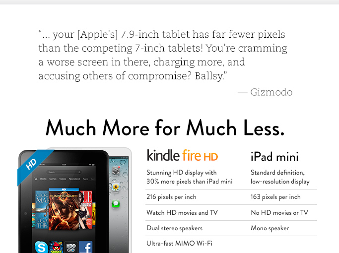
Amazon Uses Its Frontpage To Diss Apple’s iPad mini
One of Amazon.com’s biggest assets is its frontpage, viewed by millions of people on a daily basis, and, while times are getting rougher and competition tougher, the company uses it to openly criticize Apple’s new iPad. In an attempt to push kindle fire HD sales, Amazon employs pretty aggressive marketing speech and uses a heavily… Continue reading Amazon Uses Its Frontpage To Diss Apple’s iPad mini
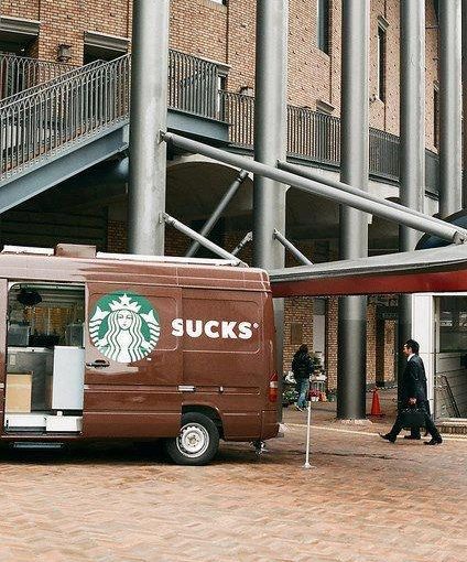
Starbucks Sucks: Unintended Typography
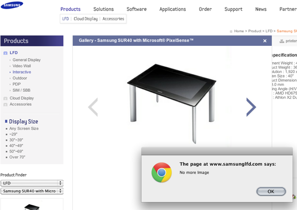
UX Mistake On Samsung’s Website
Dear Samsung, why are you showing me an active right arrow and then interrupt me with a popup saying “No Image” when you could have just deactivated or removed the right arrow?
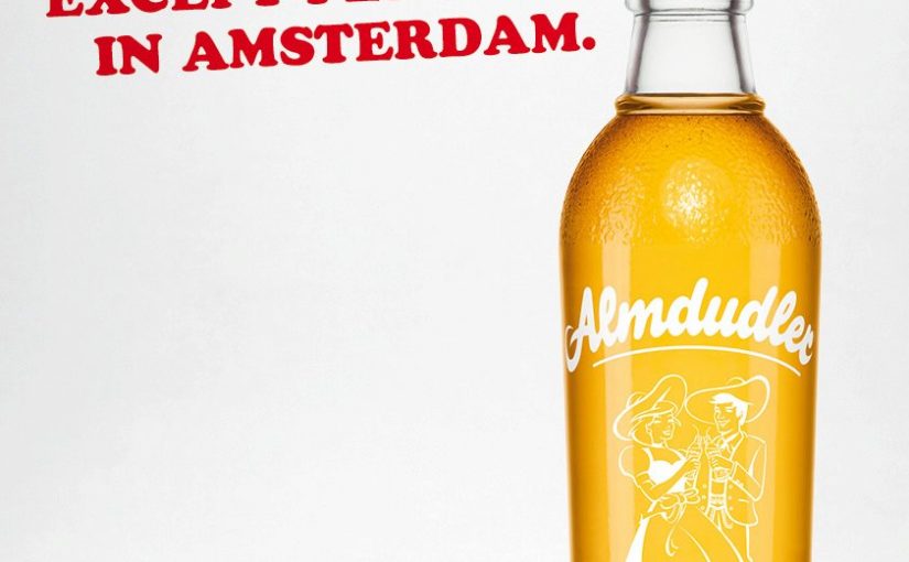
Almdudler Advertisement: You Won’t Find More Herbs … Except In Amsterdam
Almdudler: You won’t find more herbs anywhere else, except perhaps in Amsterdam.
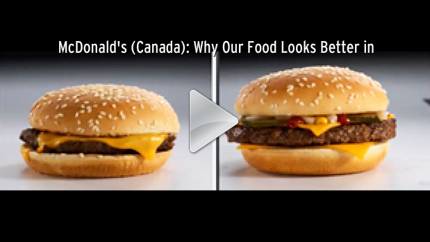
Why Your McDonald’s Burger Looks Different Than In The Ad
Food styling has to use the actual product as a basis but there is still a bigger process going on from “Actual Burger” to “Advertised Burger”. Bagozzi, director of marketing at McDonald’s Canada took a camera crew along to reveal the difference and show the details food stylists and image specialists go through to create… Continue reading Why Your McDonald’s Burger Looks Different Than In The Ad

